By FARZAD MOSTASHARI
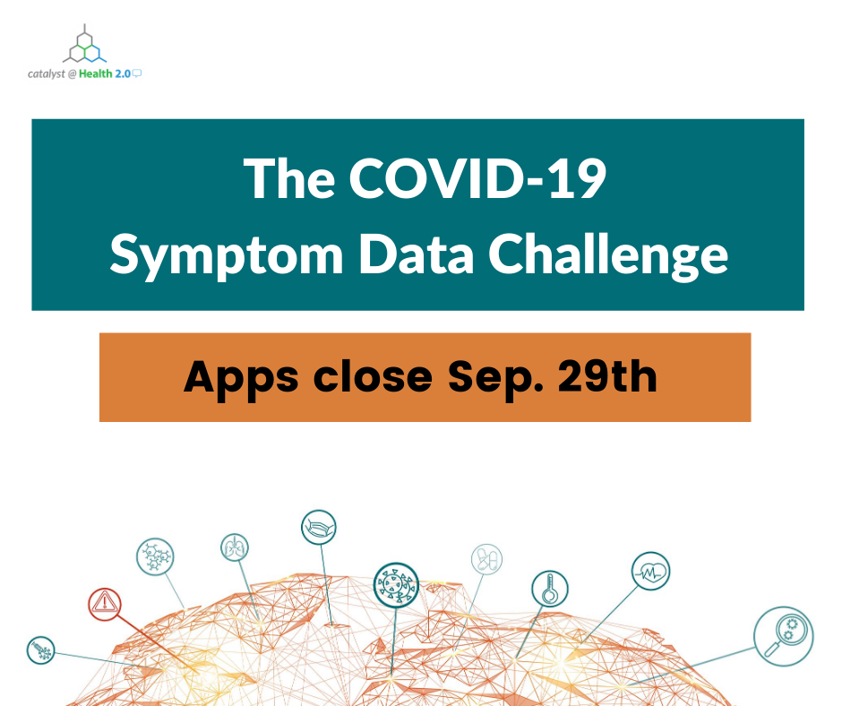
In Partnership with the Duke-Margolis Center for Health Policy, Resolve to Save Lives, Carnegie Mellon University, and University of Maryland, Catalyst @ Health 2.0 is excited to announce the launch of The COVID-19 Symptom Data Challenge. The COVID-19 Symptom Data Challenge is looking for novel analytic approaches that use COVID-19 Symptom Survey data to enable earlier detection and improved situational awareness of the outbreak by public health and the public.
How the Challenge Works:
In Phase I, innovators submit a white paper (“digital poster”) summarizing the approach, methods, analysis, findings, relevant figures and graphs of their analytic approach using Symptom Survey public data (see challenge submission criteria for more). Judges will evaluate the entries based on Validity, Scientific Rigor, Impact, and User Experience and award five semi-finalists $5,000 each. Semi-finalists will present their analytic approaches to a judging panel and three semi-finalists will be selected to advance to Phase II. The semi-finalists will develop a prototype (simulation or visualization) using their analytic approach and present their prototype at a virtual unveiling event. Judges will select a grand prize winner and the runner up (2nd place). The grand prize winner will be awarded $50,000 and the runner up will be awarded $25,000.The winning analytic design will be featured on the Facebook Data For Good website and the winning team will have the opportunity to participate in a discussion forum with representatives from public health agencies.
Phase I applications for the challenge are due Tuesday, September 29th, 2020 11:59:59 PM ET.
Learn more about the COVID-19 Symptom Data Challenge HERE.
Challenge participants will leverage aggregated data from the COVID-19 symptom surveys conducted by Carnegie Mellon University and the University of Maryland, in partnership with Facebook Data for Good. Approaches can integrate publicly available anonymized datasets to validate and extend predictive utility of symptom data and should assess the impact of the integration of symptom data on identifying inflection points in state, local, or regional COVID outbreaks as well guiding individual and policy decision-making.
These are the largest and most detailed surveys ever conducted during a public health emergency, with over 25M responses recorded to date, across 200+ countries and territories and 55+ languages. Challenge partners look forward to seeing participant’s proposed approaches leveraging this data, as well as welcome feedback on the data’s usefulness in modeling efforts.
Indu Subaiya, co-founder of Catalyst @ Health 2.0 (“Catalyst”) met with Farzad Mostashari, Challenge Chair, to discuss the launch of the COVID-19 Symptom Data Challenge. Indu and Farzad walked through the movement around open data as it relates to the COVID-19 pandemic, as well as the challenge goals, partners, evaluation criteria, and prizes.
Transcript: Farzad Mostashari on the Covid19 Symptom Data Challenge
Indu Subaiya: I’m delighted to be talking today with Farzad Mostashari about the COVID-19 symptom data challenge, in partnership with Facebook Data For Good, the Delphi Group at Carnegie Mellon University, and the joint program on survey methodology at the University of Maryland. So thank you for being here as we launch this challenge. Help us set the stage, because on March 7th of this year, you noticed something unusual going on in New York City. Tell us about that.
Farzad Mostashari: I was part of the first group of researchers 20 years ago to say “There’s all this data that is part of the universe floating around that we’re not using for public health purposes. What if we did?” The urgency at that time was around pandemics and bio terrorism both.
And we developed this whole field of what became known as “syndromic surveillance”, public health surveillance, real time epidemiology, where we were like, “What if you tap into what’s going on and apply these new statistical methods?” So at that time, the stone that we polished was emergency room visits and saying, “Can we receive all these data about emergency room visits happening in New York City?” And now it’s national. And be able to track, not diagnosed cases of anything, but syndromes. Is there a respiratory syndrome? Is there difficulty breathing? Is there influenza-like illness going on in the community?” And we set up these systems. And one of the other things we did in New York City, which a lot of other jurisdictions didn’t do, was we created a public facing transparency tool view of that.
So 10 years later, I was sitting in my basement like so many other people worrying about what’s going on with COVID. And now at that time in New York City, there were two diagnosed cases of COVID. But there was a lot of concern. And I went on that website, and it’s a public website, but people just didn’t know about it. And I clicked through, and I saw that cases of people going to the emergency room with respiratory distress, with difficulty breathing, with cough and fever had doubled and tripled just in the past few days. And what that told me was there are not two cases of COVID in New York City. There are tens of thousands of cases and they’re doubling every three days.
It took two weeks between that realization and when the schools were shut down, when the city was shut down. The promise and the premise here is that if we trust those signals, if those are trusted signals, we don’t have to have hundreds of thousands of people infected and tens of thousands of people die. We can intervene sooner. The public and policy makers can both make decisions based on data that is more timely.
Indu Subaiya: It seems almost there are three requisite factors that play into this vision that you’ve really set up beautifully. And one is that you need open data. You need access to data that you’ve always evangelized for and built in New York City and other places. You need to have mechanisms for early detection and early warning. But there’s something else you’ve always advocated for, which is the engagement of citizen scientists. So speak to how those underpinnings of the vision came together to design this challenge specifically.
Farzad Mostashari: So I got to hear about this incredible effort that’s underway that no one knows about (to a first order of approximation) which is that there are millions of surveys a week being done all over the globe, 70 plus countries, and in every state and territory in the US where millions of people every day, they go on Facebook, they see that there’s an opportunity to take a survey about COVID from an outside university, Carnegie Mellon, or University of Maryland for the global data. They click on that and they leave Facebook and they go to this other webpage and they fill out a survey that asks questions around, “Have you had symptoms in the past 24 hours? Has anyone in your household? Do you know people [who have]? Do you wear masks? Have you been careful when you go outside?” And they’re answering these questions and they’re actually being statistically weighed so that it’s not a convenient sample, it’s not whoever happens to have a thermometer at home or whatever. It’s like real time, reliable information. But it’s not being used!
Tom Frieden, my former boss and now leading Resolve To Save Lives (a wonderful global public health organization) and I were brought in to give our thoughts about this effort. And we were both like, “This is amazing. You should push it out.” And they pushed out the data in an open API. Anyone can go to the Delphi CMU. And three months later, it’s still not part of the Pantheon of data that we’re using to assess what’s happening with the COVID. Despite all the shortcomings in all the other data systems, people aren’t using it.
And I think to your point, the data is there, but the engagement on polishing the stone hasn’t occurred. The validation of it hasn’t occurred because we don’t have enough eyes on it. And it is not integrated into people’s understanding of what they should do. “Should I send my kid to school? Should I go to the store? Do I wear a mask this week?” These are real decisions that real people have to make every day, and we’re not giving them the benefit of what might be something that could be a real game changer.
Indu Subaiya: Well, we’ve seen firsthand in some of the early analyses with this data. Speak a little bit to just some of the insights that you’ve seen where symptom data can tell us something differently and earlier than case rates, death rates, the kinds of data inputs that we’re currently used to seeing, for the ways that this can do better.
Farzad Mostashari: Yeah. So theoretically, let’s think about the advantages. Over the three major sources of data, if I said to you, a citizen scientist, “How do we know what’s going on with COVID in our community? How do we know if an outbreak is occurring? How do we know if the outbreak is peaking? How do we know if it’s coming down?” There’s three sources of data that we are trying to look at. And all three are flawed. The first is obviously how many diagnosed cases we have. Case numbers, case positivity, lab tests. Well, the problem with that is we had a huge dearth of lab capacity early on. There are still parts of the country and parts of the world where there is not great lab capacity. And that lab capacity is changing. And even when we do the tests, they’re delayed now by seven to 10 days.
And the positivity can’t necessarily be relied on either, because it depends on what population you’re testing. If you turn on testing of a bunch of young people, you might have a different rate. If you start testing asymptomatic people, you might have a different rate. If the people follow the CDC’s recommendation and they stopped testing asymptomatics, you can have an increase … So it’s very much dependent on testing behavior. You’re seeing it through this lens of testing behavior and that lens can distort.
The second source of data could be deaths. Deaths are highly reliable. They’re still underdiagnosed. One of our scientific committee members, Dan Weinberger, and a group of other researchers and I published an article looking at excess deaths compared to COVID deaths. And there’s actual discrepancies between those two, but death is a pretty hard data point. The problem is it’s weeks delayed. If we waited until we saw deaths to say that we have a problem, the outbreak would have run wild through a city before we can even address it.
And then the third source of now traditional surveillance are the syndromic surveillance, emergency room, hospitalization, syndromic data that we pioneered 20 years ago. And the problem with those is that the lens you’re seeing those through is health seeking behavior. And if people change their likelihood of going to the emergency room, going to doctor’s offices, it obscures that lens.
So with all three of these, the symptom survey data presents unique advantages. Compared to deaths, it’s much more timely. In fact, compared to any of the other data sources, you would expect it to be the first indicator. It’s completely unrelated to health seeking behavior or testing availability. And if you think about, and particularly in the global context, there are many countries where the lab capacity is really challenged, and even death surveillance, mortality surveillance is really challenged. This could be a major tool.
That all having been said, what we have now are very preliminary evidence that this could be useful. And what we’re looking for are many, many more people to put eyes on the data and find ways to polish those stones, to have the highest-value ways, for society, of using this information.
Indu Subaiya: So available to all the citizen scientists in the world as of today will be access to these datasets through APIs, through aggregate CSVs. And Farzad, what will be the primary challenge questions that they’ll be able to engage with and tackle?
Farzad Mostashari: The main question that we’re asking is can you find a way to validate whether adding in the symptom data into all the other existing data sources we have can improve the sensitivity, the specificity, the timeliness of our ability to detect what’s going on with the outbreak. What are the inflection points? When is it taking off? When is it flattening? When is it coming down? And to be able to provide useful information for policy makers and the public in guiding their decisions.
So we’re leaving it pretty wide open, right? Come with your methods, come with your visualization. Do you want to look at it on an age stratified basis? Do you want to combine it with lab data? Do you want to incorporate the mask wearing information? Do you want to think about the granularity of it in space? Do you want to look county level, HR level, state level? Do you want to look at it in terms of time? Do you want to look at it by week or by day? All of those, do you want to apply statistical methods, clustering methods? You figure it out. But answer the question: “what is the best case to be made for how one would incorporate this data into the Pantheon of public health surveillance tools?”
Indu Subaiya: And even though we have the academics, if you will, working on this, we’re really looking for all comers.
Farzad Mostashari: All comers.
Indu Subaiya: Even if you’re not a trained epidemiologist, but you have an interest in this data, we are making it available as of today. And contestants will have four weeks to come up with their analyses. And then we’ll have some semifinalists that will present to the scientific committee. And at that point, up to five teams will be chosen to advance to a second round where they’ll build visualizations and simulations, prototypes of this analysis in action. So as the contestants submit their analyses after the first four weeks, the scientific committee will be looking at certain criteria. What can people expect their submissions to be judged on?
Farzad Mostashari: Well, I think it’s kind of like having a special issue of a journal. We won’t be as tough on the formatting and references as we would a real journal article, but we’re basically doing the evaluation of the validity of the results.
How convincing is the evidence that’s being presented in terms of the additional utility of adding the symptom data and how? What are the methods that are being used? The second is the rigor with which these analyses are done. Have they considered biases confounding, some of the other potential causes for false associations? What are the limitations of that? The third is impact.
If there’s a method that’s so complicated that it takes 20 days to run on every day’s worth of data, well, that’s not going to have as much impact. But what is the real likelihood of impact?
And related to that, but distinct, is the user experience. How easy is it to explain? How easy is it to visualize? How easy is it to make actionable those results from the analysis? These four criteria are going to be used in the first phase. And then when we do the presentations and then with the final result, when we select the grand winner of … What is it, $50,000? That’s huge!
Indu Subaiya: That’s right. And the second place gets $25,000.
Farzad Mostashari: $25,000! Those are the same criteria are going to be used for each of those levels.
Indu Subaiya: Fantastic. I also want to remind folks that outside data can be brought in as long as it’s made publicly available so that we can continue to feed this repository of access to data, and hopefully really combat this epidemic together.
So Farzad, one of the ways that we can help contestants understand the data sets being made available is there’s so many partners here. Where did these data sets come from, and how does privacy work given that people have taken these surveys?
Farzad Mostashari: The surveys are suggested to folks who are on Facebook. But then when someone clicks on that banner ad that says ‘do you want to take a COVID survey,’ they leave the Facebook environment entirely, and they go off to the University of Maryland or Carnegie Mellon’s website.
I think it’s important for people to understand where the data comes from is from those anonymous surveys that are done by the universities. There is no access to the line-level data for the folks at Facebook. They don’t want it, they don’t have it.
But that micro data is actually available to university researchers. But there are extracts made from that, which are anonymized, minimum cell size at the various levels of granularity that are currently being made public through APIs and we will make a CSV download available as well.
Those are fully anonymized, fully aggregated. No one’s identity is obviously going to be impacted, just says “in this county this week, there were these many cases of people who complained of having recent cough symptoms” and so forth.
This is part of the Facebook Data for Good project, and I certainly believe that this is data for good.
Indu Subaiya: And Farzad, what is your hope as these teams come forward with these ideas? Where can these findings be deployed? And what is your vision for where it goes from here outside of the challenge?
Farzad Mostashari: Our hope is that these become just a part of the, alongside deaths and cases and hospitalizations, it’s just part of what people look at. So when you go to COVID tracking or COVID Exit Strategy or the Hopkins site or the CDC, or when states or cities or governors are looking at their data, this is one of the factors that they also consider. But also the public. As Tom Frieden likes to say, “When you check the weather to see if you should take an umbrella, you should be checking a website that tells you what’s going on with COVID activity in your community”- that can help guide many of the decisions that we have to make, unfortunately on a daily basis, until we have herd immunity or a vaccine, or both.”
Indu Subaiya: Absolutely. So some real, very impactful outcomes expected from this challenge. It’s not just an academic exercise. Folks evaluating the finalists will be looking for how to adopt these algorithms and these visualizations into their public health dashboards, into their decision making processes. So it’s a really incredibly exciting opportunity.
One of the things this challenge will be doing is inviting people to join a Slack channel so that they can communicate with each other. We don’t see this as a one-time submission and then off you go, but really as a means to engage the community. That’s always been at the forefront of what you’ve evangelized with the health technology community.
Farzad Mostashari: None of us are as smart as all of us.
Indu Subaiya: We’ll go live today. And I just wanted to have a chance for you, Farzad, to share the vision behind it and what good looks like. So we’re really excited to be helping support the challenge mechanism itself here at Catalyst. So thank you so much.
Farzad Mostashari: And thank you and the team for helping sponsor this. And I hope the contestants will have a wonderful experience.
Farzad Mostashari is CEO of Aledade, former National Coordinator for Health Information technology, and former Deputy Commissioner at the New York City Department of Health and Mental Hygiene
Fine print: Participation subject to Official Rules NO PURCHASE NECESSARY TO ENTER/WIN. A PURCHASE WILL NOT INCREASE YOUR CHANCES OF WINNING. Entry deadline September 29th, 2020 at 11:59:59 pm EDT. Open to legal residents US and worldwide who are at least the age of majority in their jurisdiction of residence, excluding Crimea, Cuba, Iran, Syria, North Korea, Sudan, or other countries or regions subject to U.S. export controls or sanctions. Void where prohibited by law. Participation subject to Official Rules. See Official Rules for entry requirements, judging criteria and full details. Administrator: Health 2.0 LLC. Sponsor: Facebook, Inc. Partners: Duke Margolis Center for Health Policy, Carnegie Mellon University, University of Maryland, and Resolve to Save Lives.
Categories: Uncategorized

